I have only skimmed the article, and it does look interesting.
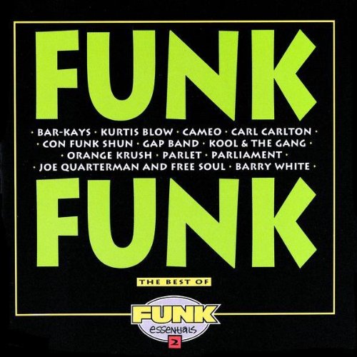
As anecdote, I can say that the first thing that I thought of when I saw the type face was that it seemed like something I would associated with funk music (possibly this cover), which seems in keeping with the thesis of the linked piece.
It is interesting, even if it is in a white sans-serif typeface on a dark background (harumph).
The first thing I thought when I saw the typeface was "that's the cover of Native Son!"
I thought of the Franz Fanon books that Grove Press reprinted a few years back, though those have some extra widgits to them. Like so.
I thought of American Spirit cigarettes and how I can't really tell the difference between the yellow ones and the blue ones.
The yellow ones are banana flavor.
4. Which is weird, because neither the typeface on the Native Son book cover in the linked article, nor any of the ones I found in google image search, look much like Neuland or Lithos to me.
The guy who wrote that is a partner at my ex-boyfriend's design firm.
8: Weird, you're right. It matched the typeface on my mental image of the cover. Probably this means I'm a racist.
9: And the guy quoted at the top of it sat next to me in tenth grade physics -- we spent most of the class doing crossword puzzles.
Typographers get around.
And always return by carriage.
Weird, you're right. It matched the typeface on my mental image of the cover. Probably this means I'm a racist.
Native Son is mentioned in the article, though.
The first thing I thought when I saw the typefaces was "one of those is on the cover of Native Son".
By the mid-1940s, long after Art Deco had left, Neuland's use in African-American texts remained. Famous African-American books such as Richard Wright's Native Son and Wulf Sachs' Black Anger (Plate 20) use Neuland on their covers.
Essear, you're rehabilitated. Ham-Love, you're on notice.
By the mid-1940s, long after Art Deco had left, Neuland's use in African-American texts remained. Famous African-American books such as Richard Wright's Native Son and Wulf Sachs' Black Anger (Plate 20) use Neuland on their covers.
I was confused by that. The two covers shown (plate 20) do not appear to use the same type face.
Typographers have dirty fingers.
19- maybe the smaller yellow print on Native Son is in a Neuland? I can't find a big enough version of the cover to tell.
Rudolf Koch was born in 1876 and had a career that was both uninteresting and undistinguished until he enlisted in the German Army in 1907 to fight in World War I.
His career may have been dull, but he was psychic.
I used to be a typographer, but I've now stopped for a period.
Eh, by 1907 you didn't have to be. (Well, if he enlisted in 1907 to fight in The Great War, he didn't have to be psychic. If he was actually aiming for World War I, I'm impressed.)
Interesting article, neb. Thanks. It reminds me, at a minimum, that these kinds of cultural cues are just as much visual as verbal -- I tend to forget that, being heavily verbally oriented.
The final lines of the piece if anyone didn't get that far:
If, as John Gambell suggests, the typefaces we as a society choose in which to set our messages are meant to stand in for the speaker of the words themselves, than how should we see a speaker with Koch's "new black face"? If we want to know why the words of African-Americans continue to be lost, we must come to recognize that the "new black face" that voices in Neuland adopt is not a new face at all: it is simply a mask for the old black stereotypes that still persist today.
(I confess I had to scroll to the bottom -- the white-on-black format was bugging me -- in order to see where this was going.)
I'll start writing "orientated" if you don't cut it out. Then everyone can just look at me funny.
Interesting. At first I thought, oh yeah, that's the typeface used on the African-American volume of the Pantheon fairy tale & folklore library—but wrong book, it's actually the same collection's American Indian Myths and Legends. I knew that that American Spirit packaging reminded me of something.
I knew that that American Spirit packaging reminded me of something.
Joy? Relief? Having a BMI within spitting distance of what it is supposed to be?
the white-on-black format was bugging me
Racist.
30: None of the above. I think they taste gross, except maybe the ones in the black box.
Man, Oakland Public Schools in the late 80s was ground zero for Neuland abuse. You know how they put things in brightly colored comic-sans to make them kid-oriented? We got loads of stuff like that, except blacked-up. Green, red, or yellow lined Neuland, and if they really meant business they'd add squigglies.
32: But they were healthier than regular smokes. Native Americans, even drawn ones from ads, can't falsely imply something that isn't true. It goes against their spirit.
I've had to work with Comic Sans recently (school auction website), and it finally occurred to me what Comic Sans says: "I'm so not serious, I'm not even serious about being funny."
35: When I smoke, I smoke Shermans, which lack both additives and the acrid taste of racism.
I never heard of those at the time.
Where I have seen typefaces that look like this is in zoos. Maybe it's a Jurassic Park effect. But it's always seemed sort of creepily "and now we will take a safari into darkest Africa!" to me.
When I smoke, I smoke Shermans
What do you use to light them, the state of Georgia?
Yeah, but it doesn't really make a whole lot of sense, does it?
I hate seeing comic sans where it's not appropriate, so when I use it for papers, I make sure to draw a person in the bottom left corner of each page and then encapsulate all the writing in a speech bubble.
When I smoke, I smoke Shermans
Because they light first time, every time.
(Old Royal Armoured Corps joke.)
Typographers get around.
And always return by carriage.
This one belongs in the Stanley hall of fame. Also, major bonus points because I think he was born too late to have ever used a typewriter.
So he never got to misuse a backspace.
I remember our typing class had a text book saying you could type O for 0, but our teacher told us that would not be possible because of teh computer.